About
 |
|
 |
sea-py is intended to be an equivalent of sea-mat.
Contributing
If you would liked to contribute to maintain this list up-to-date and/or adding
some new items you can fork the
repository and edit
the pages files in the
src directory. They are
just simple Markdown files. If you are not GitHub savvy, just open issues with
corrections and/or requests of what you would like to see here.
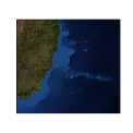
Logo
The images at the top were inspired by sea-mat’s header images, but instead of showing Gulf of Maine and a random time-series they show the Vitória-Trindade Seamount chain and a fake Semi-diurnal tide. The images were created using matplotlib and cartopy. Here is the code, enjoy:
import matplotlib
import numpy as np
import cartopy.crs as ccrs
import matplotlib.pyplot as plt

matplotlib.style.use('ggplot')


def make_map(projection=ccrs.PlateCarree(),
             extent=[-43.5, -32.5, -24.5, -14.5]):
    subplot_kw = dict(projection=projection)
    fig, ax = plt.subplots(figsize=(3.25, 3.25), subplot_kw=subplot_kw)
    ax.set_extent(extent)
    return fig, ax


def fake_tide(t, M2amp, M2phase, S2amp, S2phase, randamp):
    """
    Generate a minimally realistic-looking fake semidiurnal tide.

    t is time in hours
    phases are in radians
    """
    out = M2amp * np.sin(2 * np.pi * t / 12.42 - M2phase)
    out += S2amp * np.sin(2 * np.pi * t / 12.0 - S2phase)
    out += randamp * np.random.randn(len(t))
    return out


if __name__ == '__main__':
    # Map.
    layer = 'BlueMarble_ShadedRelief_Bathymetry'
    url = 'http://map1c.vis.earthdata.nasa.gov/wmts-geo/wmts.cgi'

    fig, ax = make_map()
    ax.add_wmts(url, layer)
    ax.axis('off')

    fig.savefig('map.png', format='png', dpi=72, orientation='portrait',
                transparent=True)

    # Time-series.
    t = np.arange(500)
    u = fake_tide(t, 2.2, 0.3, 1, .3, 0.4)
    v = fake_tide(t, 1.1, 0.3 + np.pi / 2, 0.6, 0.3 + np.pi / 2, 0.4)

    fig, ax = plt.subplots(figsize=(3.25, 3.25))
    legendkw = dict(loc='lower right', fancybox=True, fontsize='small')

    kw = dict(alpha=0.5, linewidth=2.5)
    ax.plot(t, u, label='U', color='cornflowerblue', **kw)
    ax.plot(t, v, label='V', color='lightsalmon', **kw)
    ax.axis([200, 500, -8, 8])

    # Keep the y tick labels from getting too crowded.
    ax.locator_params(axis='y', nbins=5)
    ax.axis('off')

    fig.savefig('timeSeries.png', format='png', dpi=72, orientation='portrait',
                transparent=True)